Between the Lines:
The hidden potential of social media graphics
by Ciara Shalome
Social Media Executive, 8original
A recent conversation I had with my boss, Joel Macadar, further educated me on the vast potential of Instagram graphics and their ability to convey important, yet subtle messages. It is truly no secret that social media has now become a hub for aspiring activists and educators who feel that it is their profound duty to insert their opinion into social and political issues worldwide. However, the information that often spreads like wildfire across platforms such as Instagram isn’t always the most accurate and can, in its quest to educate, further drive a wedge between users.
One such example of this would be the recent war between Israel and Palestine in March of this year, and the effect this flare up of violence had on media platforms across the world. Not only was the damaging misinformation surrounding the clashes a cause for concern, but also the many attempts from creators online to produce a blanket statement summarising the entire conflict for the sake of a graphic. As uncomfortable as it may seem, there is no one sentence that could ever possibly turn such a complex situation into a black and white concept.

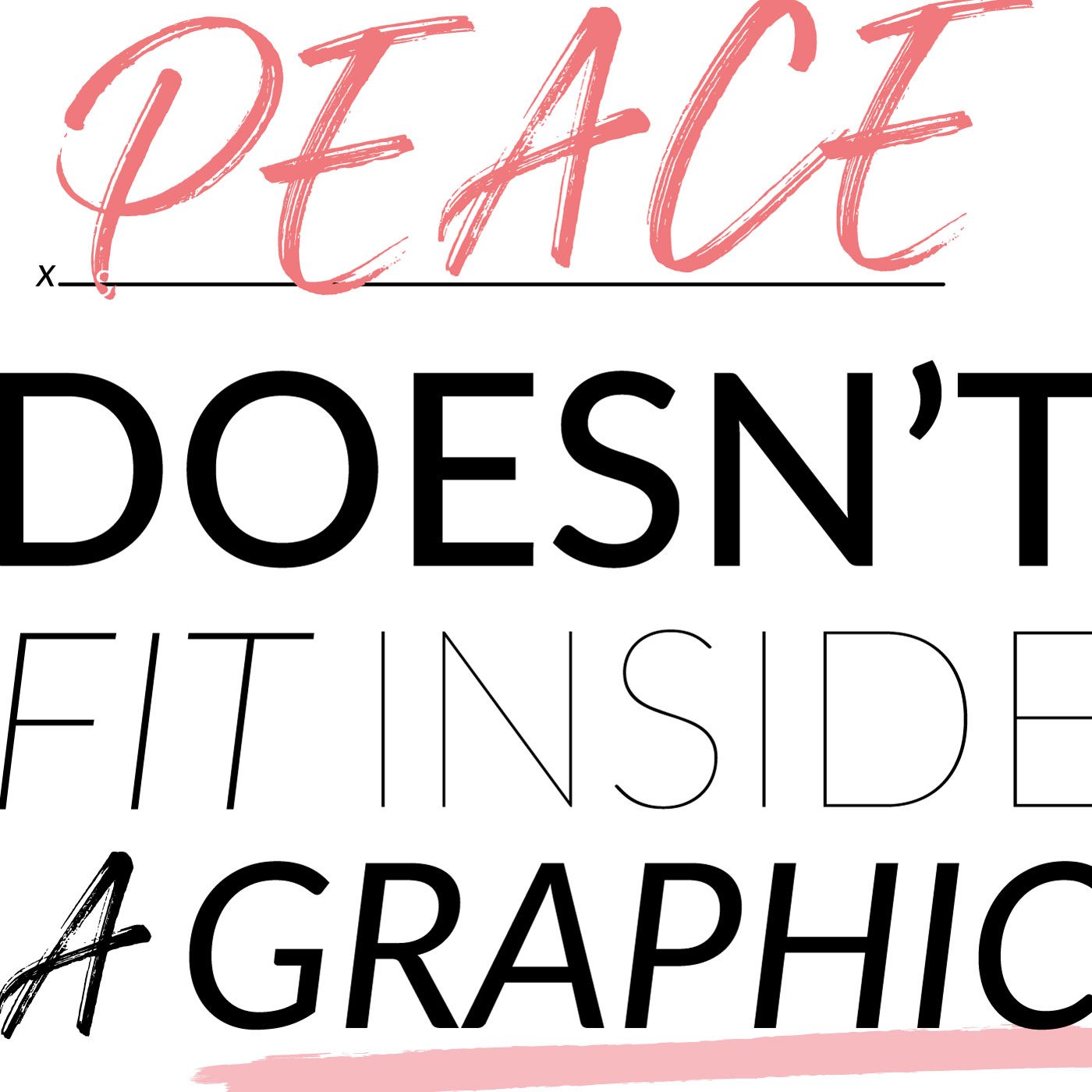
Upon seeing this graphic for the first time, I focused on the words written and nothing more. I felt that the messaging was surface level and staring me in the face. Peace doesn’t fit inside a graphic, correct. How could I possibly be missing something?
What I failed to understand until speaking to Joel was the greater context and subliminal messaging that was intended whilst creating this image. During a time of heightened societal tension, a graphic such as this one is easily able to cut through the tedium of the Instagram algorithm and inspire brief thought to whoever sees it. The words are merely a vehicle for the underlying reality that definitive statements, no matter how positive, are unable to bring about peace.
From a visual perspective, an array of fonts have been used in order to guide the attention of the reader to the overall conclusion that text, just like peace, does not fit inside a graphic. This has been further demonstrated by the oversized lettering. The choice of font aims to create a general sense of irony before focusing on the main point. My eye is particularly drawn to the two words ‘peace doesn’t’ for the simple reason that the colour red and a bold font are tactics typically used to command attention. Aside from the more surface-level observation, I notice that the negative use of the word ‘doesn’t’ sparks intrigue and forces me to see that the message here is neither positive, nor negative but rather factual. If I were to imagine my Instagram feed back in March, this graphic would have been a welcome, neutral interruption in a sea of bias.
Initially, something else I missed was the line underneath ‘peace’ and the ‘fill in the blank’ template that had been used. Joel cleverly demonstrated here that there is a multitude of concepts that cannot be blatantly summarised in five words. The existence of this line seeks to show that this image is easily recyclable, which unfortunately proves just how prevalent the idea is that complex issues can easily be condensed to fit inside of a square space.
For many, this post would likely be overlooked and its overall symbolism ignored. However, I have further understood just how effective the use of graphics can be in relation to educationally illustrating important points in a non-threatening, subtle way. Ironically, ‘peace doesn’t fit inside a graphic’ is a blanket statement in itself. However, it is a blanket statement which seeks to remind and empower, instead of divide. This graphic illustrates that social media is not only a way to disseminate an opinion and gain followers, but that it can also teach people the importance of using their platform to spread a message of coexistence and create a positive impact.


